Release notes
Redesigning Dress Measurement Version 1.4
A walkthrough of the visual refresh and the user-requested features that shipped in Dress Measurement 1.4, including Custom Measurement and Reference Measurement.

Recently at Aeeiee, we released the latest version of our product, the Dress Measurement App, version 1.4, on the App Store. This new version has new UI designs and important features that the users asked for. In this article, I am going to talk about these new features and the process that went into the redesign.
A quick intro to Dress Measurement
Dress Measurement is a measurement-storing app that allows you to save and send clothing measurements to whomever and wherever you want. One of the greatest things about Dress Measurement is that the process of saving measurements is simple and easy, and the user gets to back up their data on iCloud and refer to it anytime they want. If you are a tailor or someone who needs to store or send measurements, the Dress Measurement app is your go-to app.
The purpose behind the redesign
The main purpose of this redesign was to push out some of the major features that our users requested. We also decided to make minor redesign tweaks along the way. Overall, the goal was to ensure a better functioning app and improve the app’s experience for our users.
Getting started: the brand identity
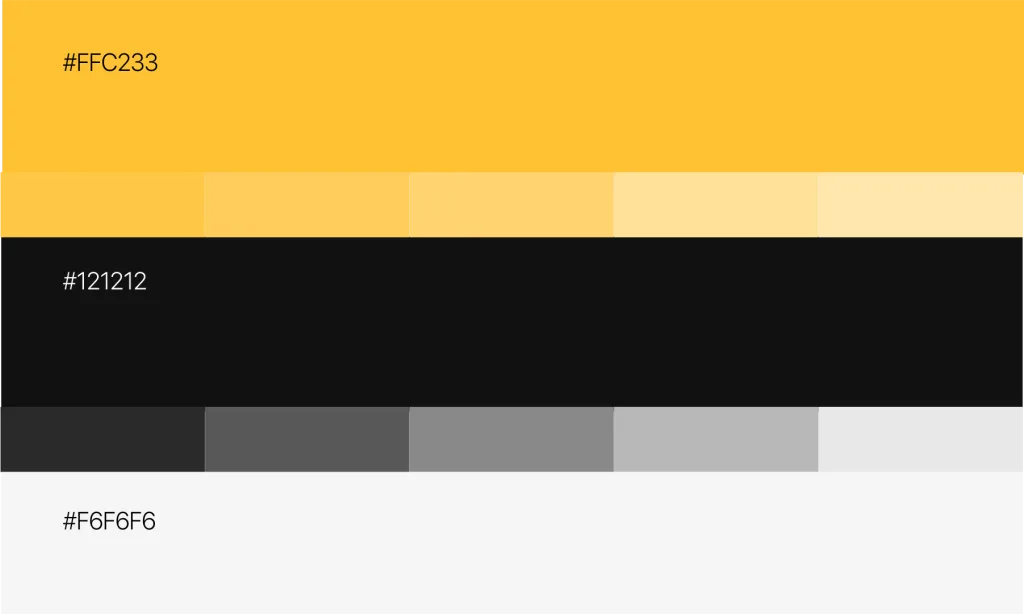
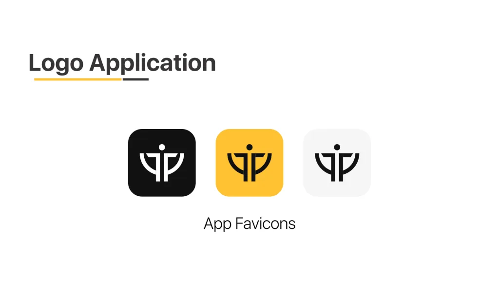
One of the major changes we made was to modify the product’s branding by redesigning the icon and changing the color scheme. For the color, we retained the color yellow by choosing a deeper shade and replaced the grey color with a black and a lighter shade of grey.
The aesthetics and user interface elements
Our goal was not only to build a functioning app but also an app that visually appeals to our users and reflects the brand. Since we had changed the branding of the app, that decision needed to reflect in the app as well. These are some of the changes we made to that effect.
Splash screen
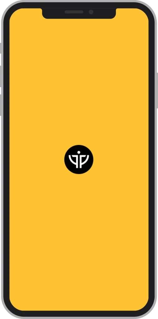
In version 1.3.4, there was no splash or launch screen. So, we added one in this new version to help improve the user experience.
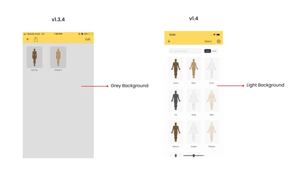
Background color
In version 1.3.4, the background color was grey, but in the new version we chose the color white. We wanted this to reflect the branding of the app. Working with these changes, we made sure that other UI elements in the app remain consistent and accessible to our users.
User interface elements
Due to the user feedback and usability testing we conducted, we changed the location of some UI elements and redesigned others.
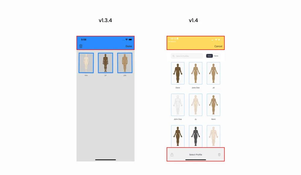
Home navigation bar. In version 1.3.4, the plus icon creates a profile, the export icon exports it as either PDF or CSV, and the edit icon brings the page into a selection mode for the user to delete. In version 1.4, these elements still retain their functions but their location in the app changed. For example, the export and the delete option are now hidden within the select button.
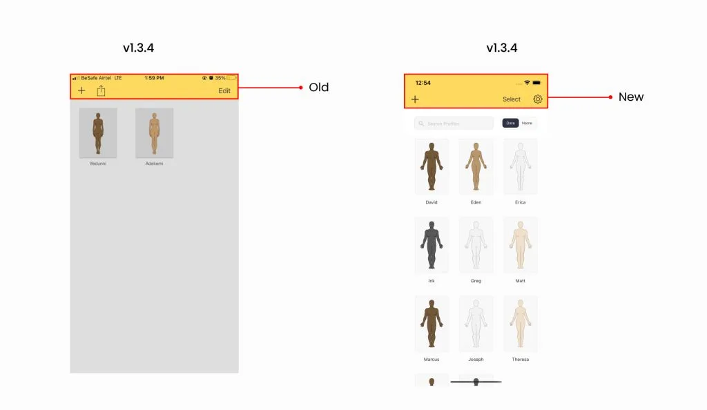
The export and delete page. During usability testing, we discovered that the participants found it difficult to locate the delete profile button. So, we placed a “select” text button on the home page. The user only needs to click the select button and the option to either export or delete appears at the bottom.
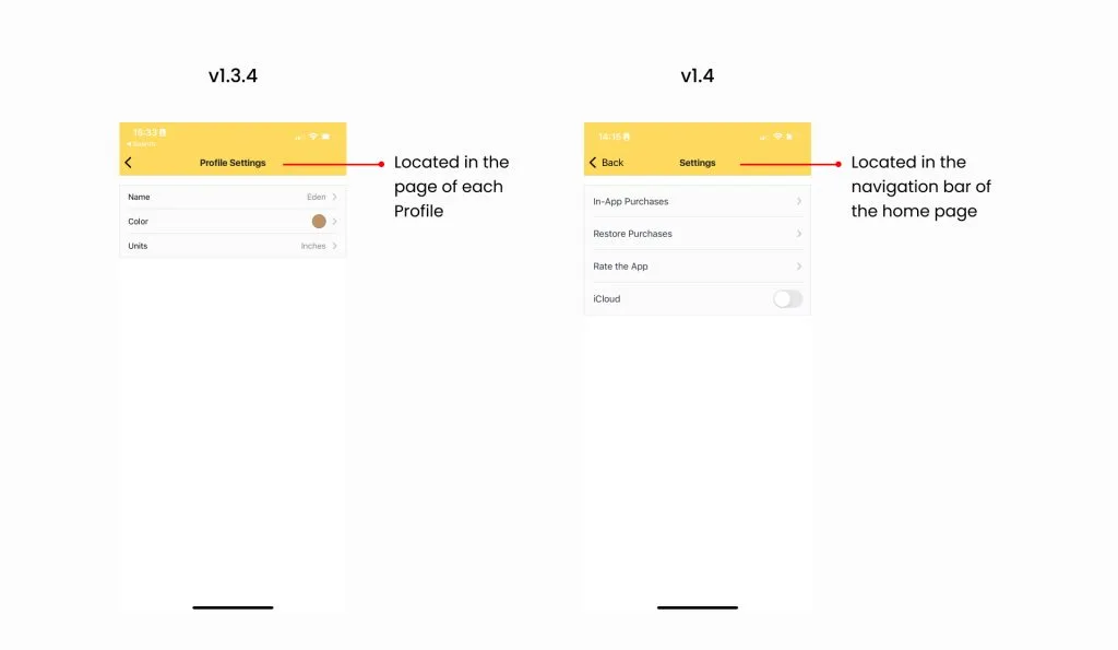
The profile and app settings pages. We discovered that both these pages were located in each of the profiles created in the app. Since the profile setting page was specific to each profile created, it made sense for it to stay with its profile. But the settings page was general to the app, so we believed it had to be in a place where the user could easily access it. Therefore, we relocated it to the home page.
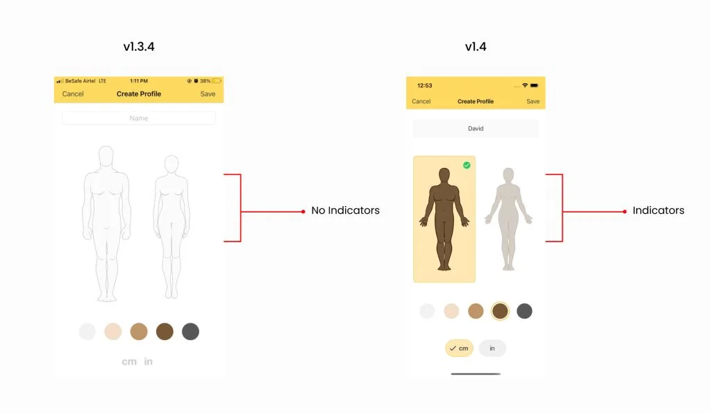
Create a profile page. The main changes were the highlights we added to properly indicate selection when the user makes a choice. This gets rid of any confusion as to what the user chooses.
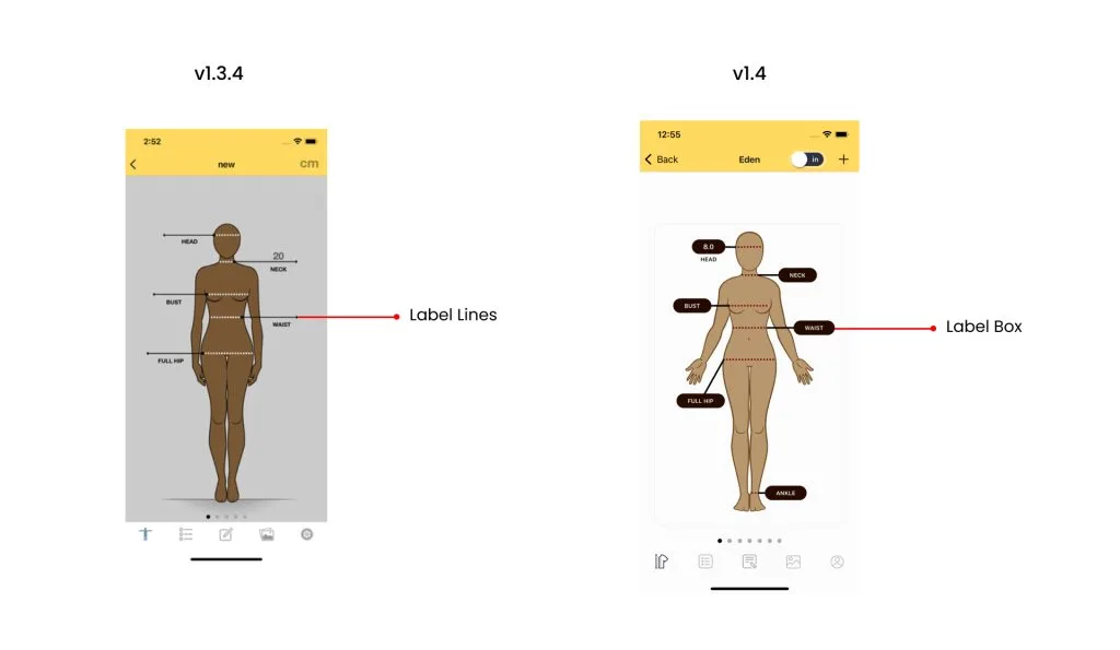
Measurement label boxes. We redesigned the measurement label boxes. The previous design did not look clickable at first sight and some of the participants misinterpreted what the arrow meant. In the redesign, we added boxes that look like input boxes.
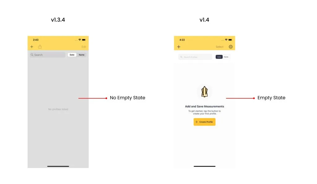
Empty states. We added empty state designs to give our users a good onboarding experience.
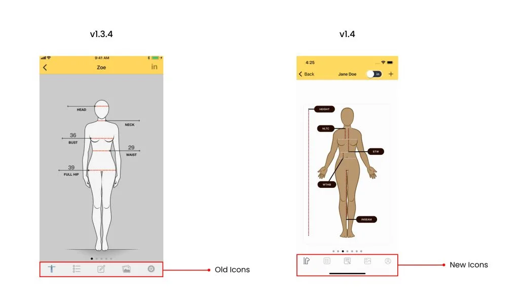
Navigation icons. We changed the icons to make them look more consistent.
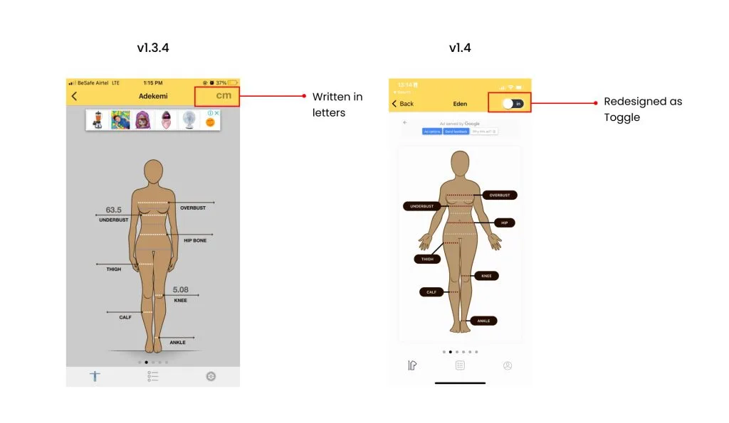
CM and IN switch. Another thing we noticed during testing was that the participants had no idea the CM and IN could be changed upon tapping. To fix this, we turned the text into a toggle icon to make it look like a switch.
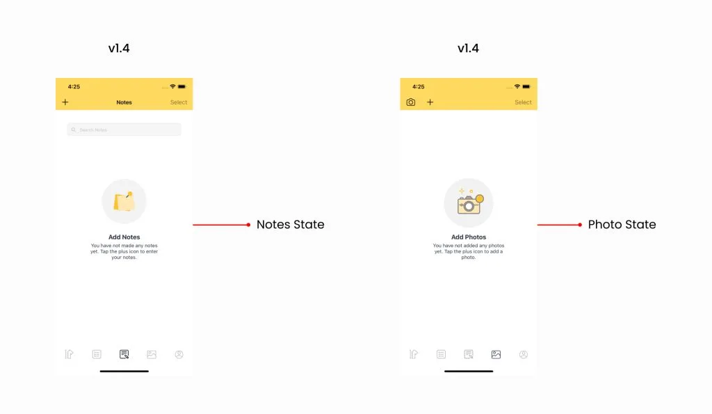
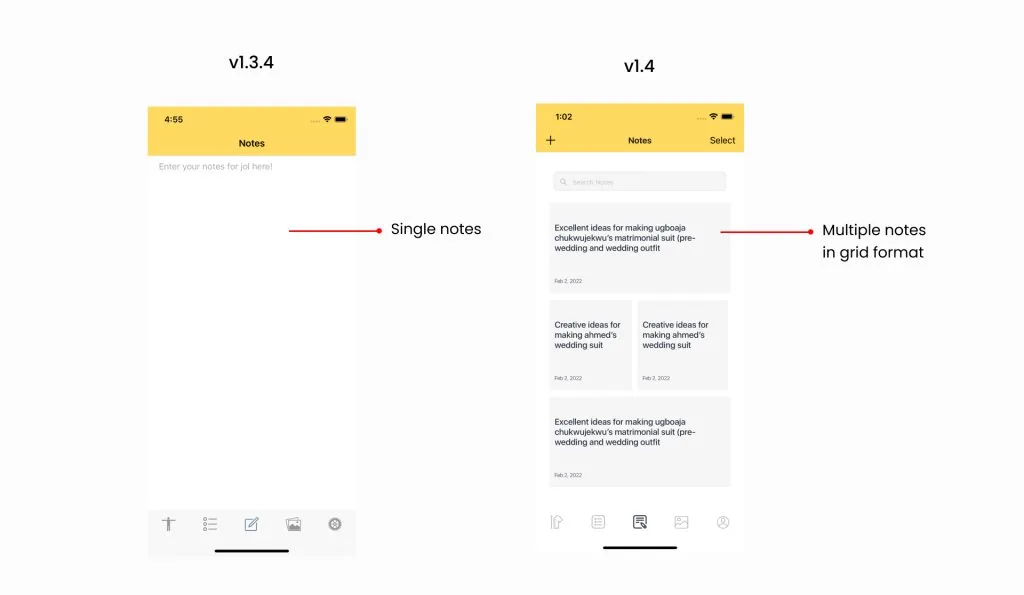
Notes. The note feature was redesigned to allow the user to create separate notes as opposed to the single format that was previously there. All of their information is no longer restricted to one space. This new format gives them the flexibility to create as many notes as they want, and they can have access to details like the time and date each note was created. Also, if the user deletes a note, they can easily create a new note without losing access to their other notes. The plus icon allows them to easily add a new note, the grid view gives them a preview of their notes, and the select button allows them to choose notes to delete.
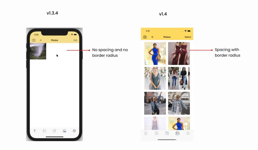
Photos page. For the photos page, the only change we made was the spacing between the photos and the border radius. The “edit” was rewritten as “select”.
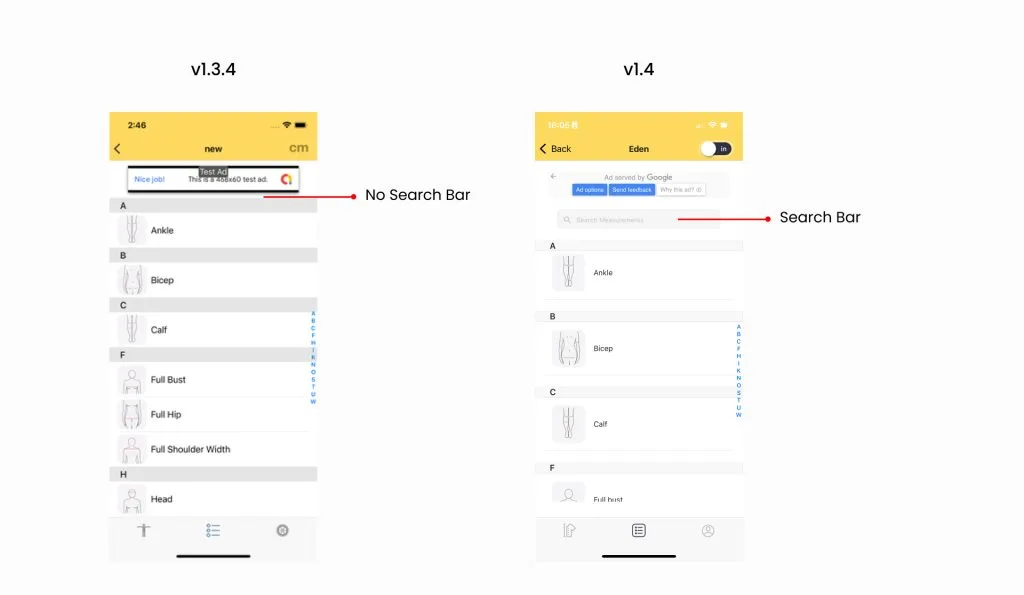
List page. A search button was placed on this page. This serves as an additional way for the users to search for their measurements.
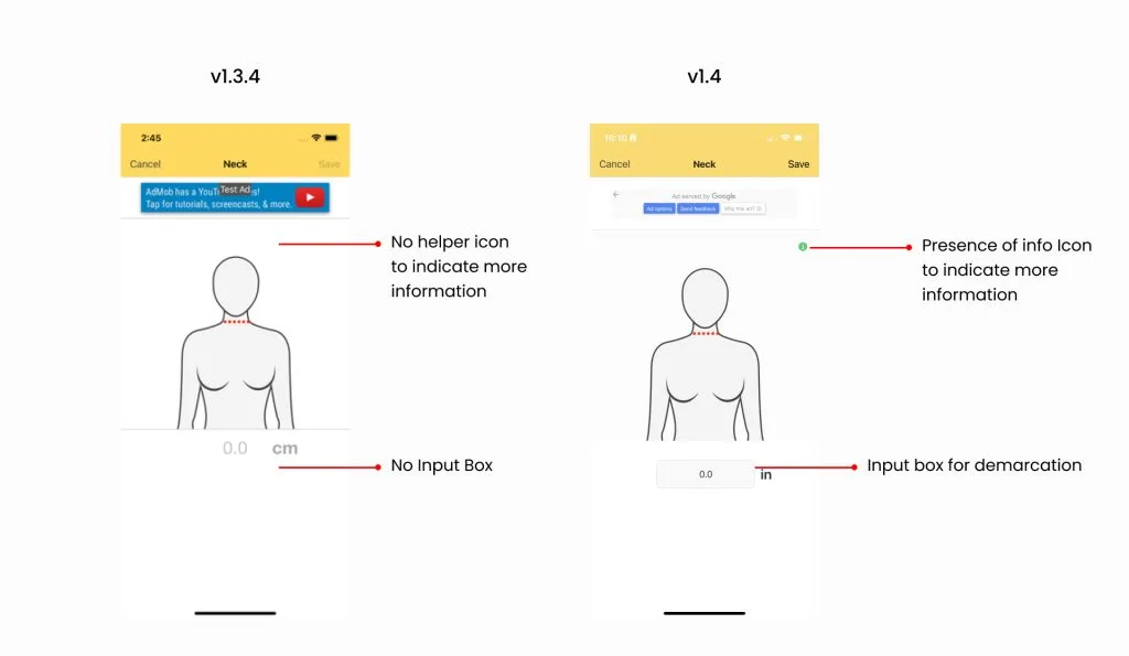
Data entry page. In version 1.3.4 of the data entry page, there is a feature that allows the users to see instructions on how to measure. But for the user to use this, they have to press and hold down on the screen. However, there was no indicator to suggest this feature to the user. So, we modified the design by placing an info icon on the page. Now, when the user taps on the icon, the information slowly reveals itself.
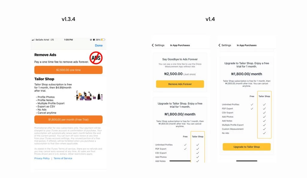
In-app purchases. We redesigned this page in such a way that our product offerings and purchases are more organized and clearer to the user.
iPad redesign
We redesigned and customized the iPad design to fit all the available space in the iPad app. We kept the home screen and the create profile page the way they are in the mobile design, but the individual profile page was redesigned. We moved the navigation icons that were originally placed horizontally to the sidebar for easy navigation and to accommodate the large spaces. The avatars and the contents of each icon now appear to the right.
The new features
Before working on Dress Measurement version 1.4, the company had already taken into account the user feedback. The major feature that the users requested was the Custom Measurement, and we also added another feature called Reference Measurement.
Custom Measurement
The Custom Measurement feature in the app allows the user to create their own measurements instead of relying only on the default measurements. There are steps the user must go through in order to create a Custom Measurement: creating a new page, choosing an avatar’s view, drawing the lines, and adding labels. These steps follow each other carefully and we included tooltips for the user to reference if they need help. The main process is simple. Click ”+” to add a line, drag the cursor to draw the line, click ”-” to remove or undo a line, then add a label and save measurements. Users can create as many pages as they want and even edit the Custom Measurement in case they change their mind.
Reference Measurement
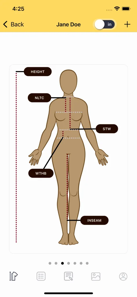
The Reference Measurement feature is a complementary feature to the Custom Measurement that allows the user to mark out their specific area of measurements. Unlike the regular measurement lines, these reference lines are always grey and they do not have labels. Notice in the picture below, the grey lines created a guide on where the main measurement started and stopped. This clearly defines the specific area the user is to measure (look at the labels NLTC, STW, and WTHB in the picture below for reference).
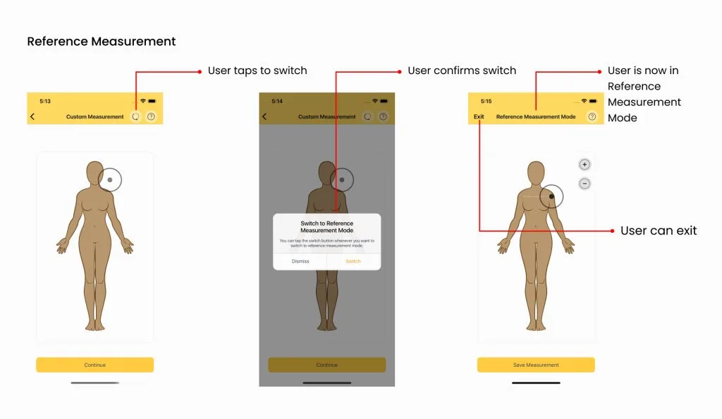
To avoid confusing the user, we created a separate page for Reference Measurement, but the process of adding the lines is still the same. The only action the user has to take to add a Reference Measurement is to switch to Reference Measurement mode. There is a switch icon in the top bar that the user can click which brings up a prompt to confirm the action.
We love feedback
Design and development is a journey that never truly ends in the product cycle. We design, iterate, test, get feedback, make improvements, and repeat. It is always a delight to receive feedback from users on how to make the app better suited to their needs.
Launching version 1.4 is a big step for the Dress Measurement App and we look forward to receiving more user feedback on the App Store. We can’t wait for our users to see the host of other things we have in store for them. If you have not downloaded Dress Measurement yet, you can get it from the App Store now or refer this to a friend you know might need it.